Cliente
Grupo Forte

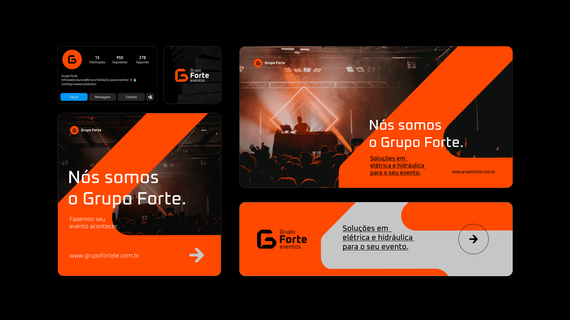
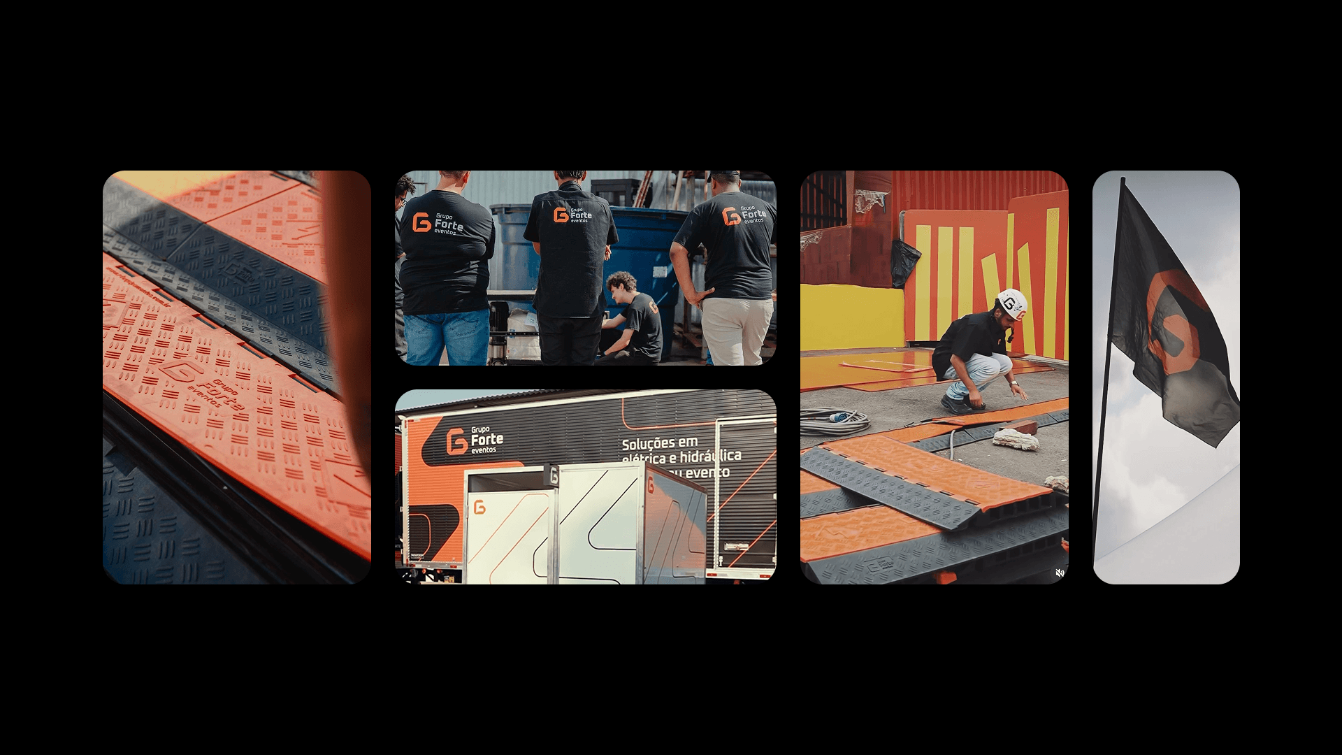
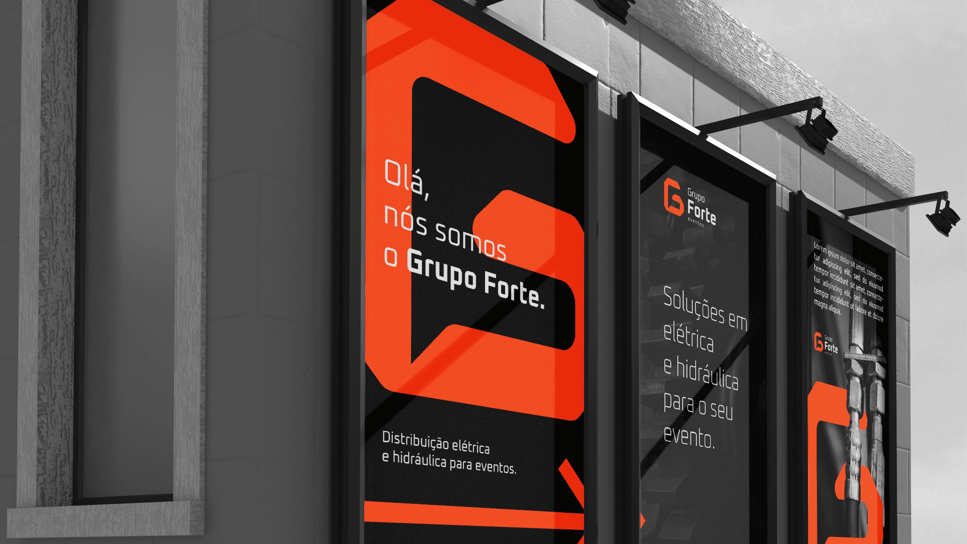
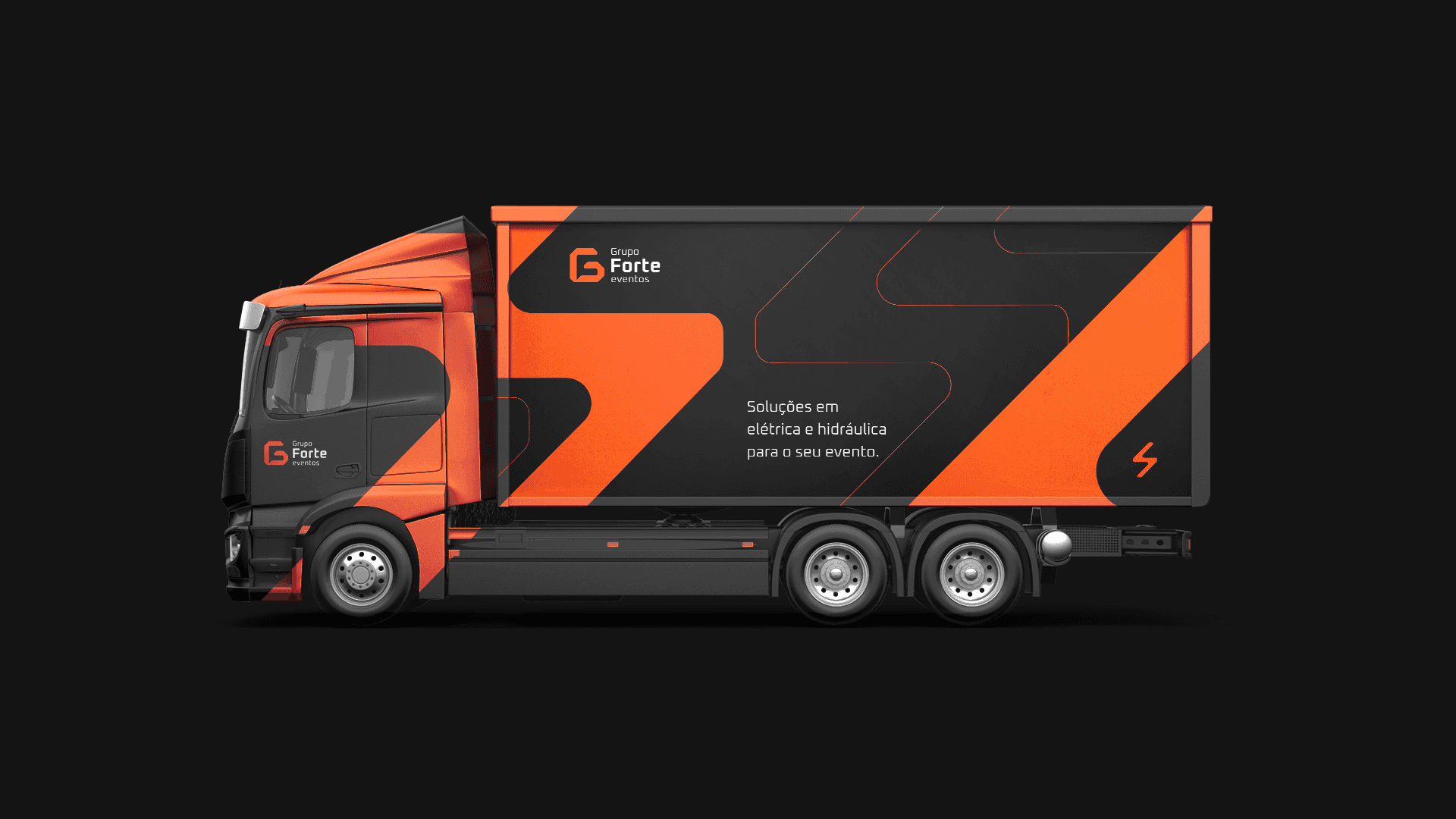
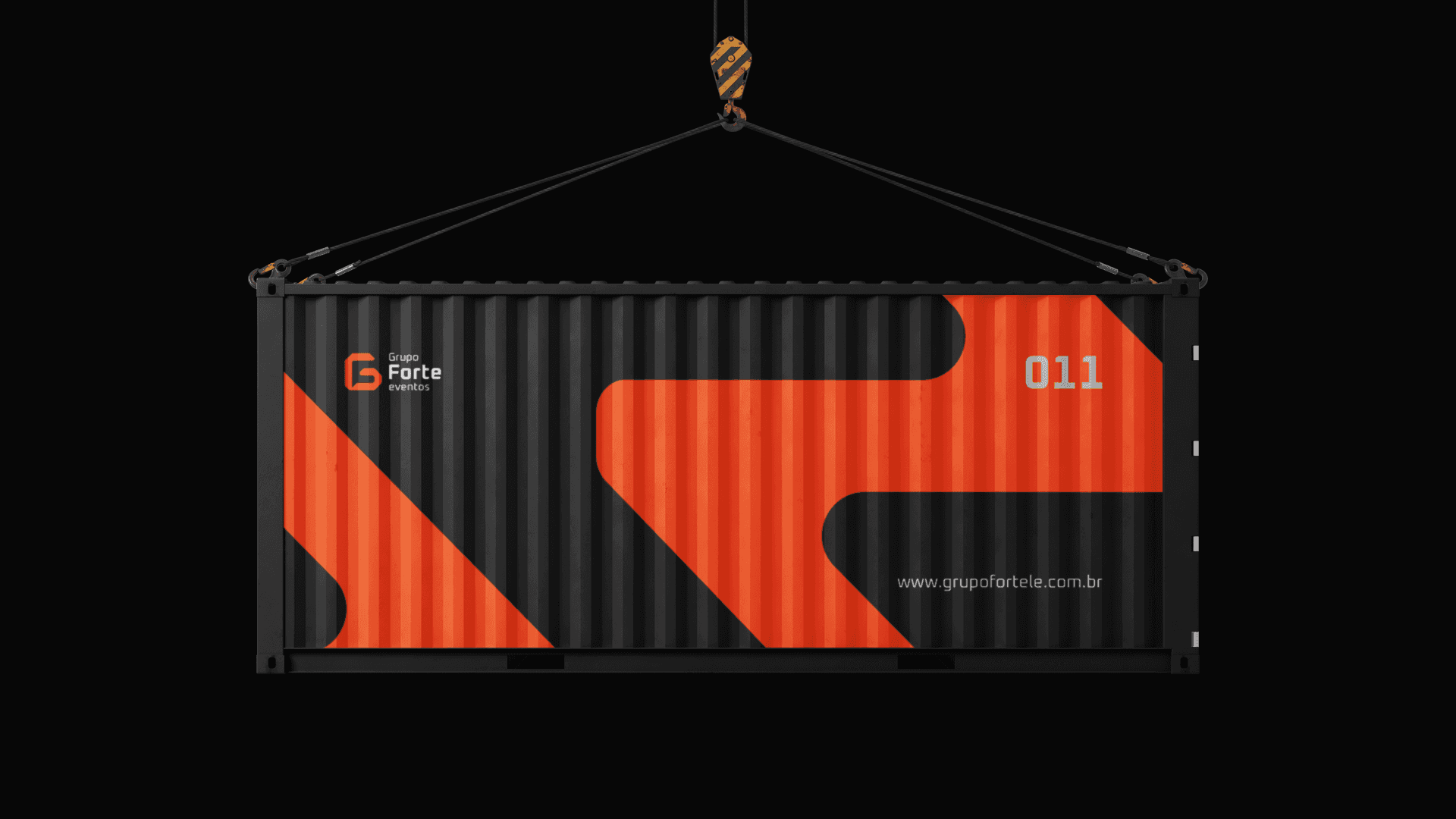
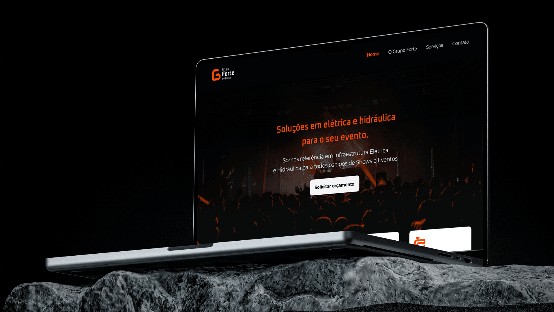
Conceito
Com a necessidade de se reposicionar e se destacar no mercado, trouxemos uma nova perspectiva visual para a marca, incluindo um novo logotipo, tipografia, paleta de cores e direção geral da marca.
Cliente
Grupo Forte
Indústria
Serviços técnicos
Serviços
Identidade de marca
Design digital
Web Design
Duração
4 semanas
Desafio
A ideia central: fazer referência ao conceito de “grupo” fundindo as letras g + f, agrupando-as em um símbolo único. Através do uso ge Gestalt, a união do “g” e do “f” se torna visualmente clara. As bordas arredondadas trazem um senso de modernidade e flexibilidade ao logotipo, facilitando sua aplicação em vários formatos. Assim como o Grupo Forte atende a diferentes setores e se adapta a cada necessidade, o novo logotipo também.