Cliente
Caio Graça

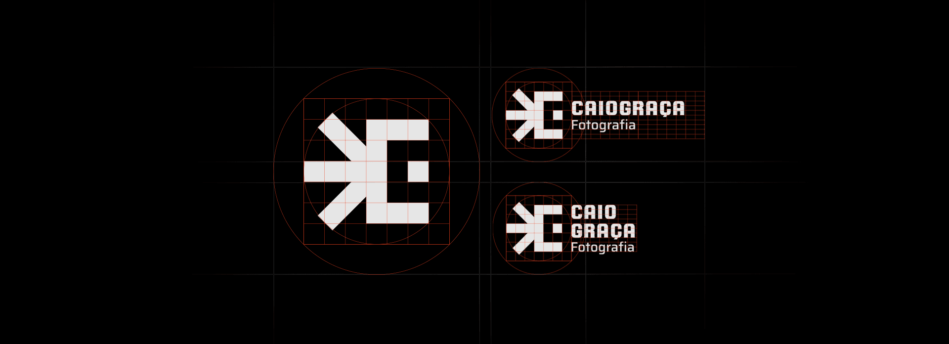
Conceito
O Caio é um grande fã de rock e principalmente da banda red hot chilli peppers, através da banda ele se aproximou da música, da arte e da fotografia. Então juntos decidimos moldar o logotipo de forma que faça referência um elemento gráfico utilizado pela banda em seu álbum "Californication". Trazendo junto cores bem contrastadas e vibrantes que tem ligação direta aos grandes eventos que são fotagrafados pelo Caio.
Cliente
Caio Graça
Indústria
Profissionais autônomos
Serviços
Identidade de marca
Design digital
Duração
4 semanas
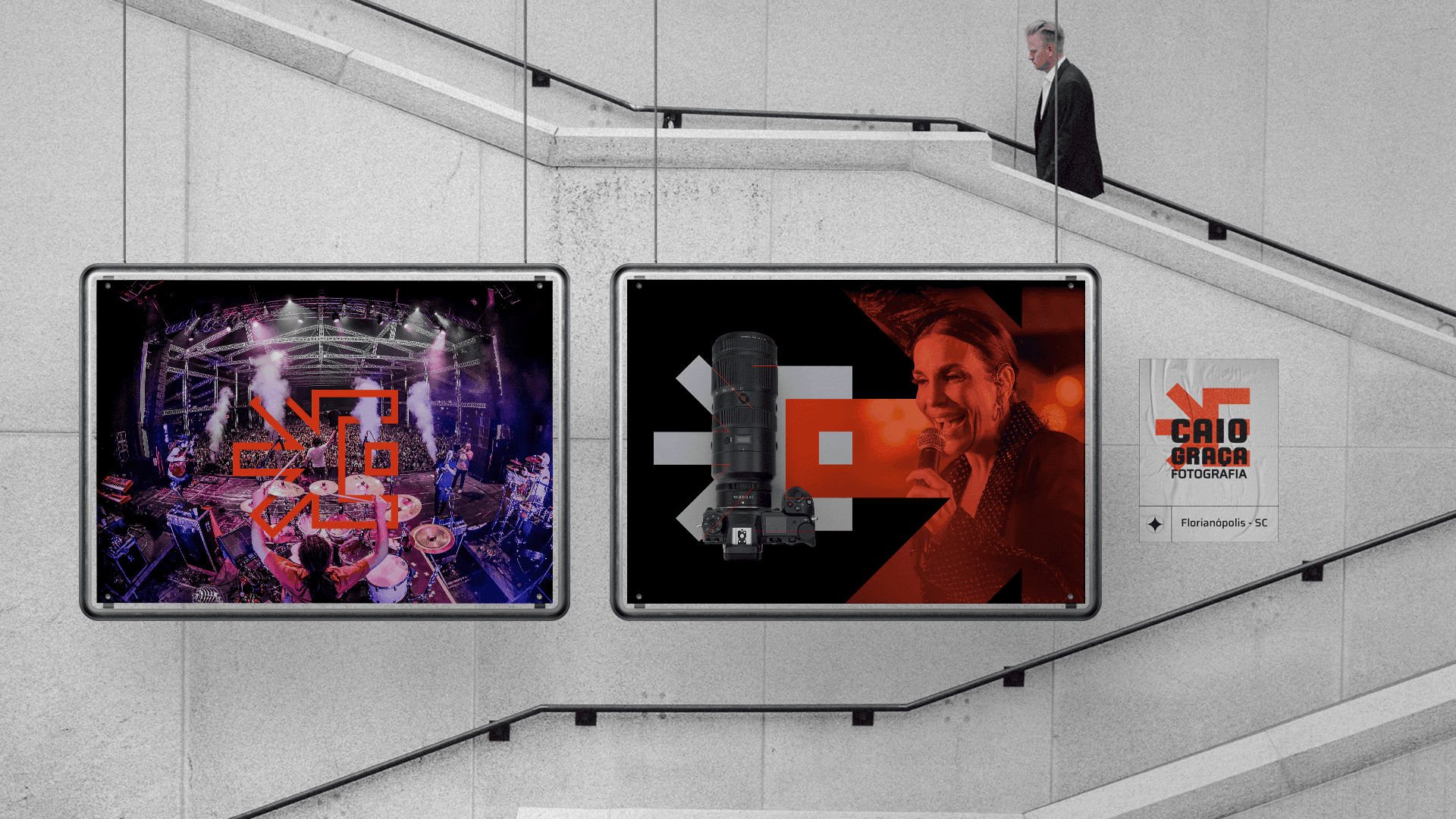
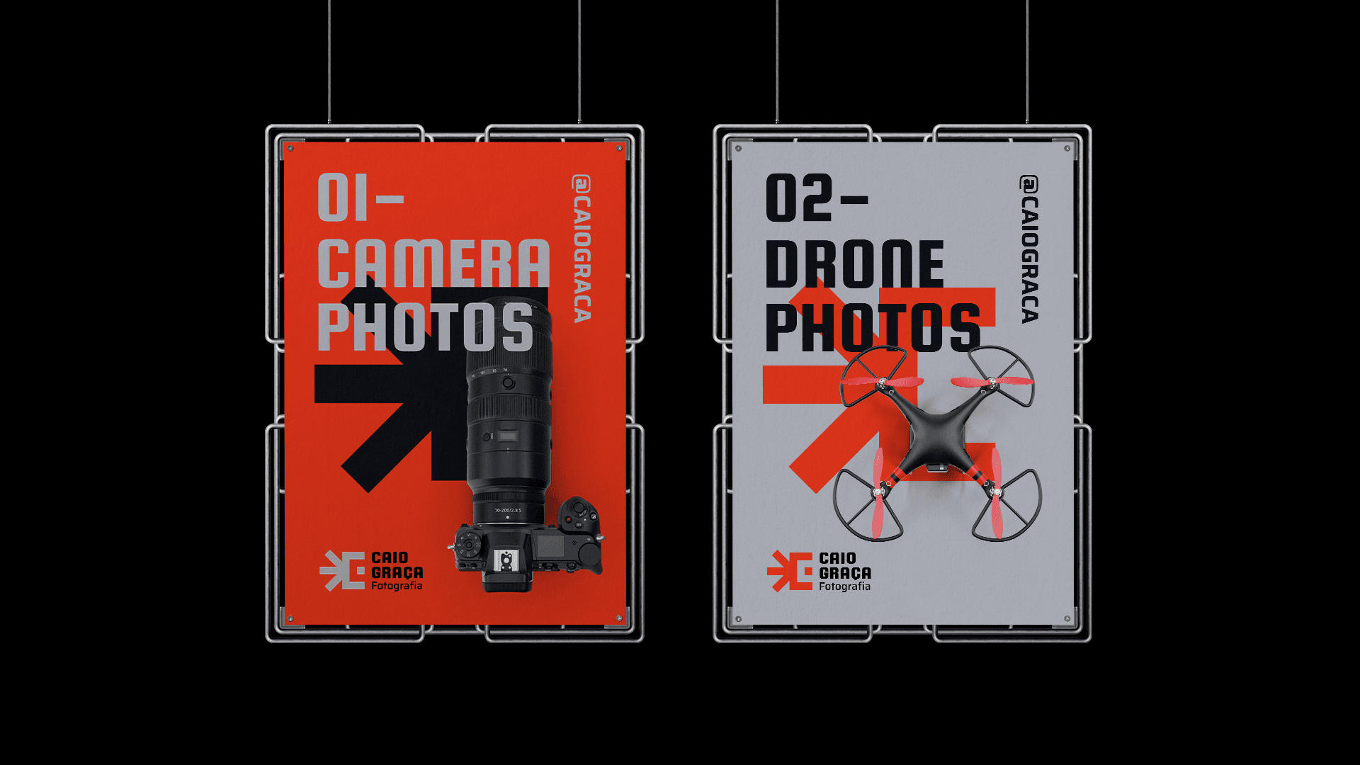
Desafio
O desafio aqui foi criar algo direto, simples e memorável e que transmitisse um pouco de toda a energia que o Caio deposita em seus trabalhos, além de ser algo que seja facilmente aplicado em materiais digitais e gráficos.