Cliente
Glowful
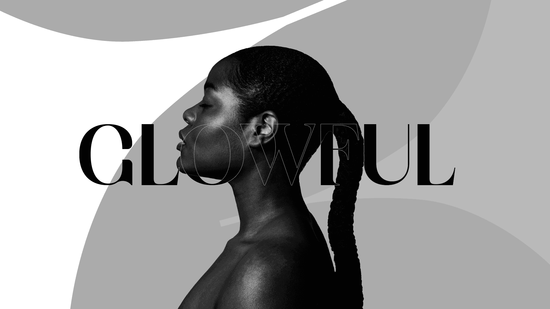
Conceito
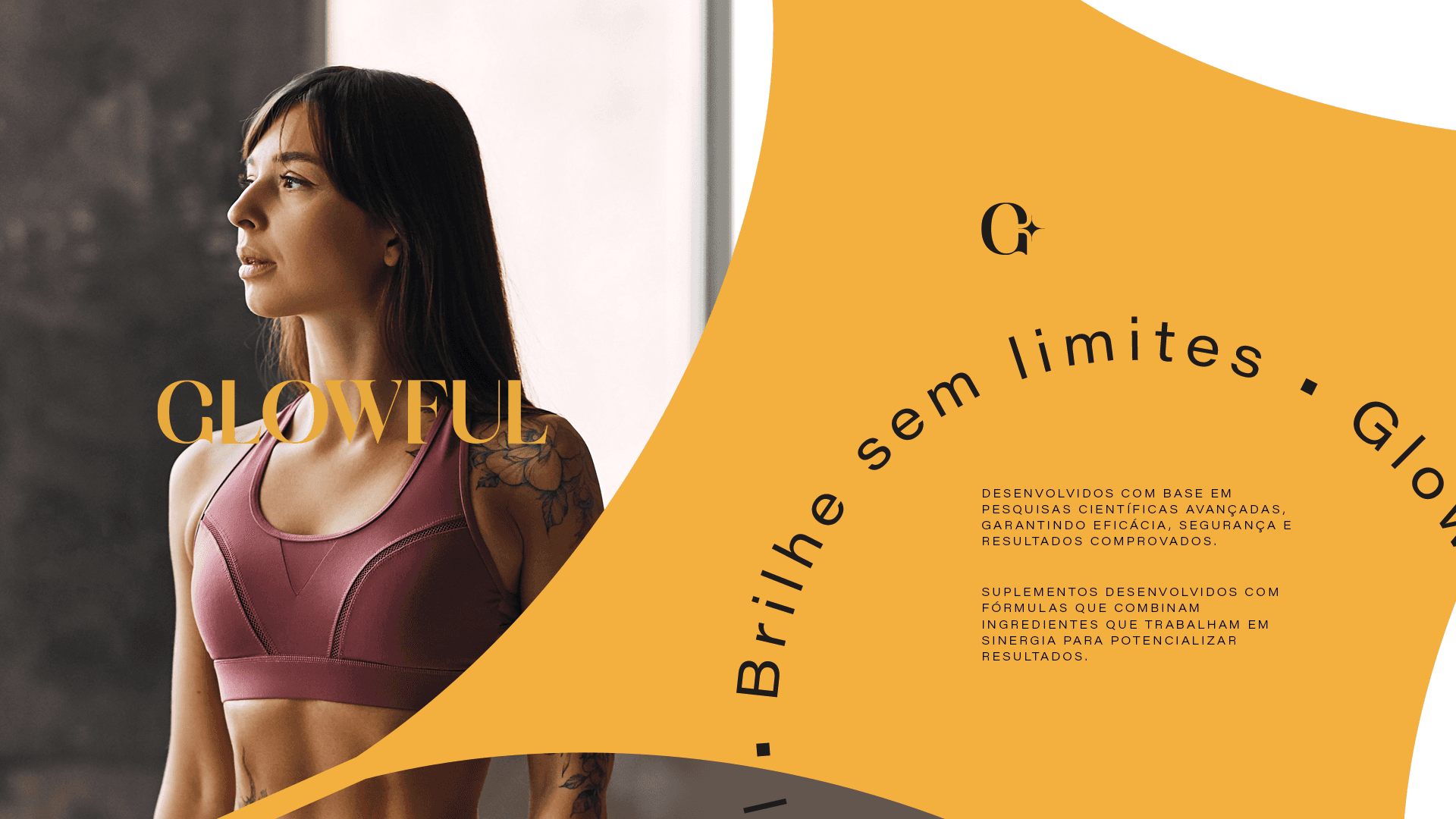
O conceito para a glowful é transimitir leveza e personalidade, isso foi feito unindo um símbolo minimalista e memorável com uma tipografia serifada que trás mais personalidade para as aplicações visuais.
Cliente
Glowful
Indústria
Cosméticos
Serviços
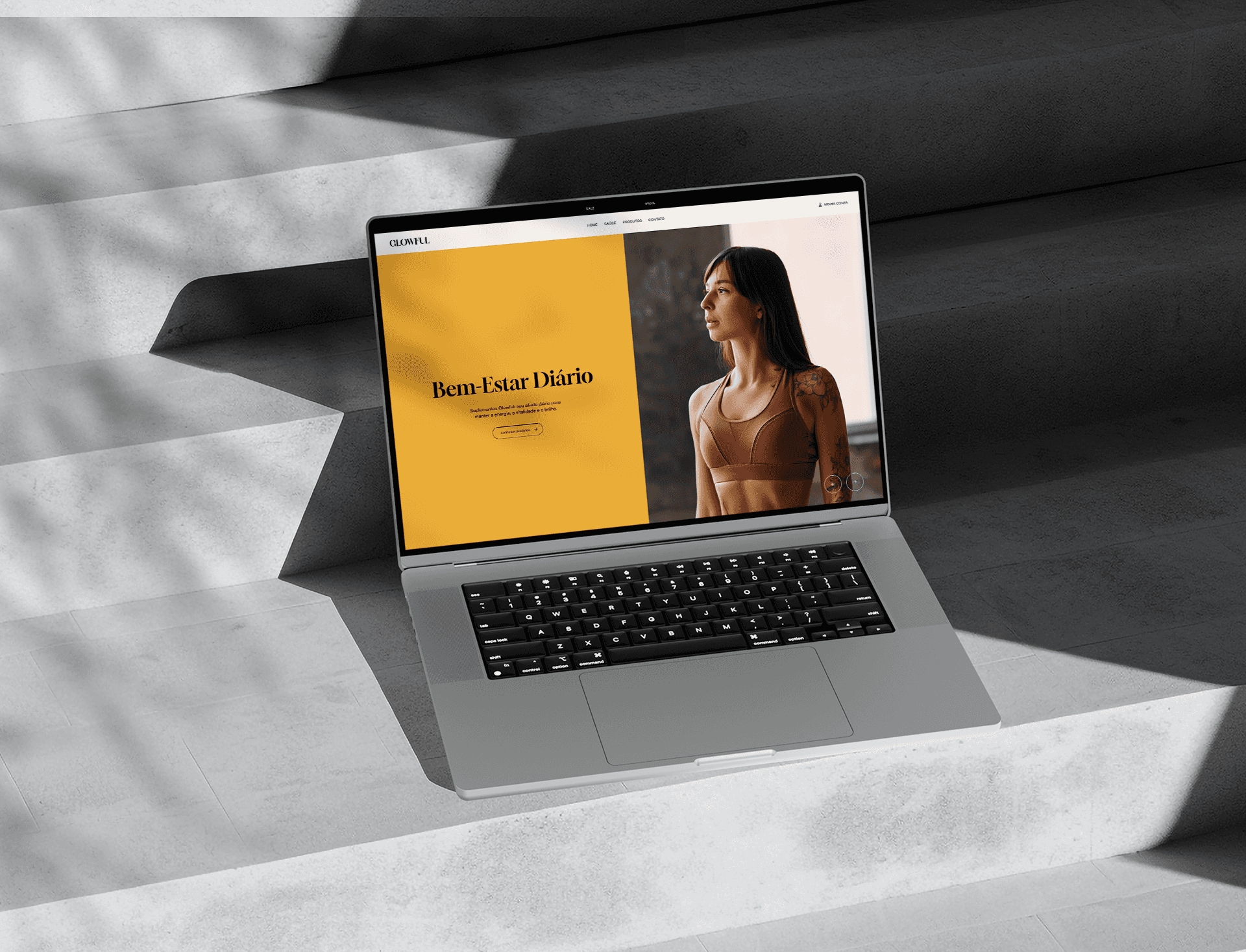
Identidade de marca
Design digital
Duração
4 semanas
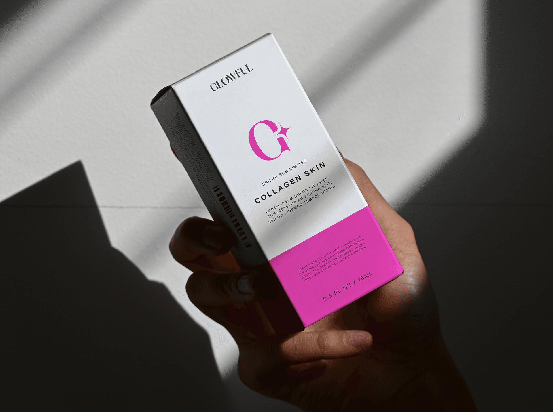
Desafio
O desafio aqui foi criar uma identidade de marca que seja sutil porém presente, direta e adaptável, por isso apostamos em um símbolo minimalista, simples com uma cor contrastante juntamente do elemento que remete ao termo "glow" de brilho.